
Giving users back their autonomy with Anchor
Anchor


ACCESSIBILITY
USER TESTING
UX
INFORMATION ARCHITECTURE
Helping older people access services with care
Anchor is the UK's largest not-for-profit provider of care and housing for those over 60.


Anchor's older audience had varying digital capabilities, as well as a breadth of physical and mental vulnerabilities to consider
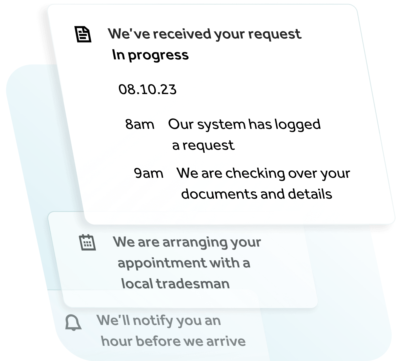
In designing Anchor's request portal for residents, we created user flows based on an amalgamation of the development platform's technical range and resident personas. These were turned into working prototypes where we gave multiple flow options to test for variances in colour, iconography, language, and brevity.
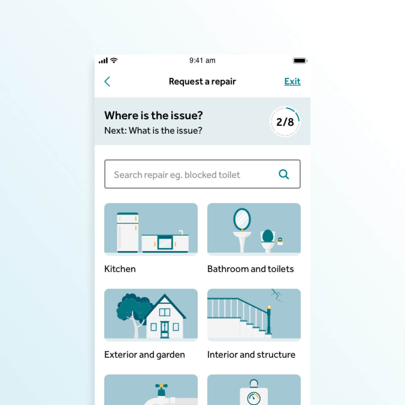
Due to the sheer amount of repairs that could be requested, and the fact that a missing one could lead to confusion and higher bounce rates, organising the services was a crucial step in this. We used card sorting exercises in a collaborative workshop to create multiple information architectures that were tested in the user flows.
Real users. Real results.
We conducted three rounds of user testing with actual Anchor residents, accounting for age, location and digital literacy. Each iteration saw users find the prototype easier to use and the end-to-end journey became clear.
We created a pattern and component library for the developers to use to ensure a cohesive and accessible look and feel.


SERVICES
Our services
Explore the many methods through which we can optimise your digital presence